Chart layouts from real report cycles

These samples show structure and labeling—not client data. Each layout is available in our monthly report or as a custom KPI set.
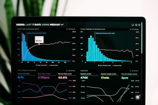

Sample utilization index bar chart layout
FIG. A — Vehicle utilization index by class
Sample idle band trend chart
FIG. B — Idle hour band, 12-week trailing
Sample maintenance spend rollup
FIG. C — Maintenance spend rollup by category
Sample scatter plot maintenance vs utilization
FIG. D — Spend per active hour scatter
Sample executive summary page layout
FIG. E — Two-page executive summary layout
Sample seasonal maintenance comparison chart
FIG. F — Seasonal maintenance band comparison

How to use this gallery

Bring figure references to your scope call—"we need Fig. B and Fig. C for our municipal board." We confirm whether your telematics exports support each layout before quoting.

Custom branding (logo placement, Korean/English dual labels) is available without changing the underlying chart logic.

View flagship report scope Request samples with your labels